published on September 21, 2020 in devlog
The work on the maintenance patch 08 has come to an end and the update has been released. Fabian provides some insights into the upcoming release and Manoj continues to work on the mobile interface design.
Michi (molp)

This was the second week of working on the next maintenance patch. As I stated in my last devlog we limited the development of this patch to two weeks, so we can start with the next big release right away. Just before I started writing this devlog I released the maintenance patch and you can read about it in this news post.
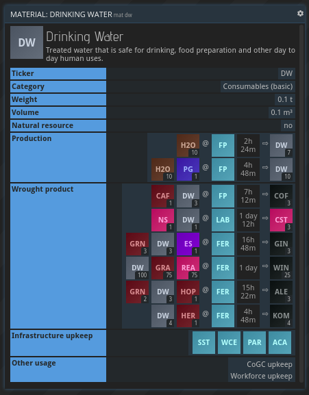
I tried to fit as many small issues, bugfixes and quality of life improvements into the patch as possible. One of the more notable changes has been an addition to the MAT command. Up until now it was not directly visible if a certain material has other usages than for building buildings or as a wrought product for another material. I added two more sections that are appended if the material is used as an infrastructure upkeep, a CoGC upkeep or a workforce consumable. I hope that makes it easier for everyone to discover what a material is good for.

I don't remember exactly who complained about the lack of a cancel button for corporation projects first, but it was a long while ago and it has since been on our list. It may not be the item with the highest priority but being able to finally remove it from that list feels good. So, every corporation that started their HQ on an unfavorable planet has now the chance to finally cancel the project and start over some place else and enjoy that sweet HQ production bonus!
Next week I will start working on the next major release and I am really looking forward to that!

Fabian (Counterpoint)
There have been quite a few discussions about the game's barrier of entry recently with one topic being prominently featured pretty much all the time: the UI. While there will be many visual improvements on the way thanks to Manoj in the future, we also need to look into at least teaching the basics of our interface in-game to new players. This is kind of the minimum viable tutorial approach we need to get to before exposing the game to a wider audience. Once you know about tiles, buffers and commands you can start exploring the game for yourself (which will always be part of its core fascination). So that's why I created a quick "prototype" (a series of slides really with highlights, pointers and explanations) of a UI-focused tutorial last week.
With ship-building coming in the next big update, another topic we've been discussing is a limit on how many "entities" (i.e. bases and/or ships) players should be able to control. There's always the danger of self-sufficiency or simply being overloaded with too many regular management tasks. Now, we don't want to put a hard cap on how much players are able to do, but we want to make the ramp a bit steeper and not just dependent on how much time you sink in. I'm currently tinkering with the idea of "entity permits", each one allowing you to own one base or ship. You can get more permits for an exponentially increasing cost. This would not just be an incentive for players to find their "optimal set" of bases and ships (or specialize on one direction altogether), but could also serve as a pretty clear goal for players who prefer not having to look for their own goals in a game (which you can still do of course). Players' entity levels could also almost create a "pseudo leaderboard" if you will. Let us know your thoughts on this matter!
A quick final note: Yes, we are constantly monitoring the planetary populations as well as your feedback about them and will make more tweaks over time. For example, "government programs" (a feature we cut from the first iteration) will probably come sooner rather than later. Their bonus growth should help boost smaller populations to a decent state of independent growth much more quickly. Also, more expensive programs might get you access to higher-tier population right away.

Manoj
I have been working on the mobile interface design for the game, more cleaner and better looking visuals of the sketches I shared earlier with you guys. Also, last week I posted my Prosperous Universe website designs for the teams feedback and received lots of comments. I'm glad they liked the designs and also there are some improvements to be done. We are trying to create a consistent design language from the website to the game and the hub. Overall a seamless experience for you guys.
As always: We'd love to hear what you think. Join us on Discord or the forums!
Happy trading!