published on May 10, 2021 in devlog
This week Fabian sheds more light on government tenders and Michi shows off more of the map redesign.

Fabian (Counterpoint)
One of last week's major topics, when it comes to figuring out how we're going to handle infrastructure in the future, was government tenders. In general, governments won't have their own inventory of building materials or be able to build public infrastructure (or provide its upkeep) by themselves, but they will initiate a tender for a certain piece of infrastructure and invite companies to make offers. Essentially this process will work as a "reverse auction," where companies offer to build an infrastructure for a certain budget, and the company with the lowest offer after a defined amount of time is awarded the respective contract.
Of course, there are lots of potential options for how this will work exactly, and we'd like to open up as many of them to the governments themselves in the long run. For example: Can companies see the offers other companies have already made? Can companies retract or modify their offers (unlimited times)? Should the lowest offer "win" automatically, or does the government hand-pick from all offers? Many small things, though with potentially significant effects on player behavior, that can help establish a government's own style of running things.

Michi (molp)
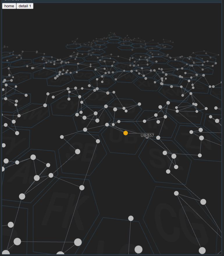
The work on the new map prototype continued throughout last week. Here is the latest work-in-progress screenshot:

As you can tell, I added the stars and their connections. Stars are rendered as plain white discs for now, but we are already looking into options on how to use their representation to convey information in the future. Their size and color properties are the first that come to mind, but the shape could also be an option.
When hovering over stars, they change to a yellow-ish highlight and a new component is presented. In the image, you can see it as a white line with the system's name next to it. This is just for demonstration purposes, the underlying framework allows practically any data to be display, and we even could reuse existing commands.
I also added the connections between the stars and realized how noisy the map looks when the camera is too close to the stars and at an angle where lots of stars and connections are visible in the background. To mitigate this, I added a shader that greys out distant stars and connections. The effect can be seen in the upper third of the screenshot.
The next steps are to make the map a bit more efficient, as it is not optimized in any way at the moment, and to look into ways to fetch arbitrary data (population densities, resource concentrations, ..) and display this data.

Nick
Last week was another week of setting up new influencers, affiliate platforms, and configuring ad campaigns. I don't have much new to add to previous discussion on that front, but I did want to remind the community about the "Name a Planet" poll that is currently going on.
We have already named one planet, ZV-194a as Nike, and right now we are suggesting names for KI-448b. I will host the final poll this week, so don't forget to vote and make your voice heard! Just as a reminder, we will be holding "Name a Planet" events every month or so. Don't fret if your favorite planet wasn't chosen, there's always next time!
As always: We'd love to hear what you think. Join us on Discord or the forums!
Happy trading!